
On this page
You have spent months on a research project, and now you have been accepted to present it at a student conference. Standing in front of a 48-by-36-inch blank canvas can be intimidating. A common mistake is simply copying and pasting a research paper onto the board. However, a poster is not a paper; it is a visual summary designed to start a conversation.
The goal is to structure your poster so that a person walking down the aisle can grasp your main idea in seconds. By using a clear layout, keeping text minimal, and making figures large, you give your work the audience it deserves.
How do I make a research poster for a student conference?
A research poster must balance technical depth with visual clarity. When an attendee walks past your board, they will look at the title and the central figure first. If it looks like a wall of text, they will walk by.
The UC Davis Undergraduate Research Center recommends treating your poster as a visual communication tool. Aim to keep the text concise enough to deliver a five-minute tour of your work. Ensure your layout has a logical reading pathway, and allocate the largest space to your most important information—usually your main results or graphics.
Instead of long paragraphs, use bulleted lists and short sentences to explain your core message.
What font size is readable from a distance?
At a crowded conference, readers will often stand multiple feet away from your poster. If they have to lean in to read your methods, the text is too small.
To ensure your poster is legible, follow a strict typographic hierarchy. While specific measurements vary by poster size, PLOS Computational Biology advises that you should never use less than a 24-point font for your main text. Your main title should be the largest element, readable from across the room, followed by section headings and then the body text.
Use clean, sans-serif fonts such as Arial, Helvetica, or Calibri for maximum legibility. Always left-align your text. Fully justified text creates awkward gaps, known as "rivers," which make reading difficult from an angle.
How should I structure the sections?
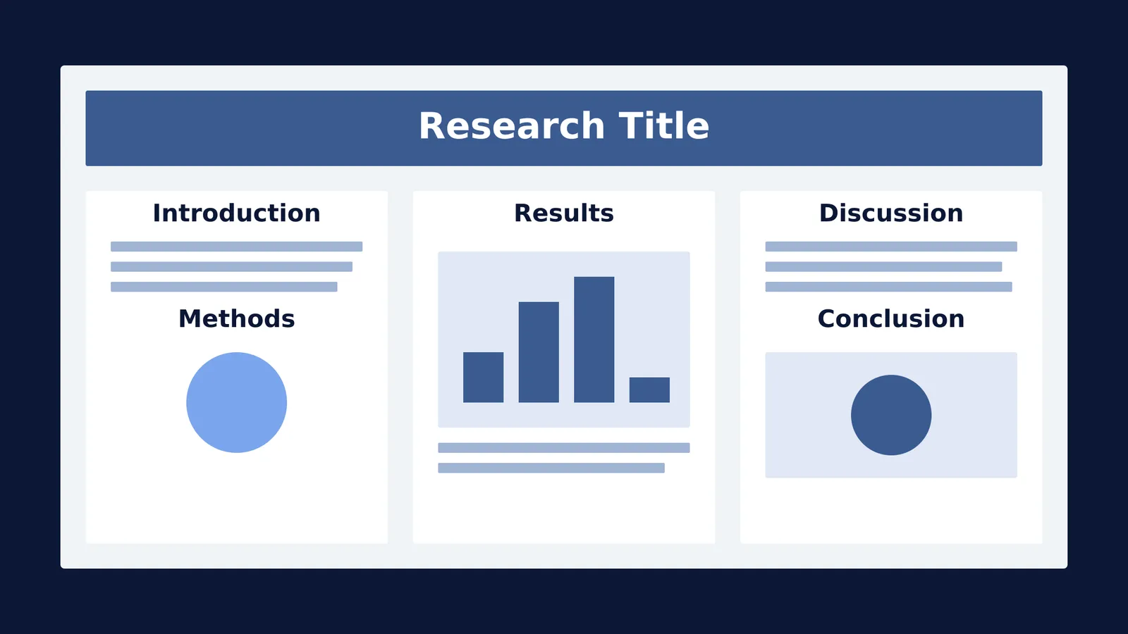
A standard poster is organised into three or four columns, reading left to right and top to bottom. Follow the flow of your research:
Introduction and Objectives: Briefly state the problem and your hypothesis. What is the one research question you are answering?
Methods: Avoid long explanations. Use a flowchart, a timeline, or a block diagram to show how you gathered your data.
Results: This is the most important section and should sit in the centre of the poster at eye level. Rely heavily on high-quality graphs, charts, or images.
Discussion and Conclusion: What do the results mean? List two or three bullet points summarising your takeaways and potential next steps.
If you need to break down the theoretical background of your research into simple explanations for your audience, the Fermi Concept Library holds every concept in physics, chemistry, biology, mathematics and computing, each with its own lesson to help you build a clear explanation.
What is a checklist for your final poster draft?
Before you send your file to the printer, run through this checklist to avoid expensive mistakes on large-format paper:
The 100% Zoom Test: Open your file on your computer and set the zoom to 100%. Step back a few feet from your screen. If you cannot read the body text easily, increase the font size.
Image Resolution: Ensure all charts and photos are exported at 300 DPI (dots per inch) so they do not pixelate when printed.
Export as PDF: Always save and submit your final design as a PDF. Printing from a PowerPoint file can cause fonts to shift or margins to change unexpectedly.
Peer Review: Ask a friend who is not familiar with your research to read it. If they can find your main conclusion quickly, your layout works.
By keeping your poster visual, clear, and readable from a distance, you can spend less time explaining your layout and more time discussing your science.
*Read next:* How diagrams help you learn physics, and how to draw good ones *and* Interleaved practice: why mixing problem types works, with a plan